We’re sure by now you must have heard that the 2015 Color of the Year is Marsala, which can be described as a very deep, rich, earthy wine red. Over the past 15 years Pantone, the global authority on color, has selected the color of the year, which usually dictates trends in fashion and home décor. This got us thinking it might be fun to take a look back to see what these colors were in past years, and why they were selected.
2000 Color of the Year: Cerulean Blue
Cerulean Blue was the first color of the year chosen since Pantone started picking a new color each year. Cerulean Blue was selected as the color that represented the millennium because of its Zen like qualities and calming influence.
Pantone felt that blue would be a good pick for the first color of the year, as blue tends to be everyone’s favorite color in the U.S., Asia, and Europe. Want to know more about this color? Check out Pantone’s press release from December of 1999.
2002 Color of the Year: True Red
True Red was the color of the year for 2002. It was selected in recognition of the impact of the attacks on the U.S. on September 11th of 2001. Pantone described the color as a meaningful and patriotic color.
Red is a very strong color known for its power and passion, but is also associated with love.
2006 Color of the Year: Sand Dollar
Sand Dollar was the chosen color of the year for 2006. It was a departure from the previous colors of the year, which had been bright and vibrant. As you may be able to tell by its name, Sand Dollar is a neutral color and was selected because it expressed concern about the economy.
This warmer shade had a very natural and organic feel to it, and it became a great choice for home décor and fashion.
2009 Color of the Year: Mimosa
Mimosa was the color of the year for 2009. Out of all of the colors picked in previous years, Mimosa was a bit different in the sense that it was a very warm and engaging yellow. Pantone chose this color for 2009 because the U.S. was in a time of economic uncertainty and political change.
 Mimosa expressed hope, warmth, nurturing and reassurance.
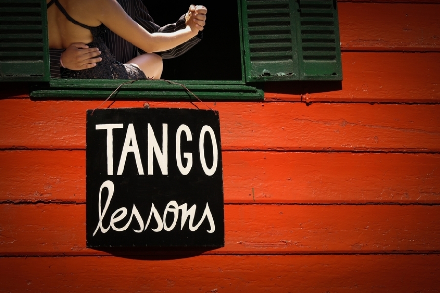
2012 Color of the Year: Tangerine Tango
Tangerine Tango, the color of the year for 2012, was kind of a fun color. It was described as a “spirited reddish orange that is sophisticated, and at the same time dramatic and seductive”.
This color was one that could bring lots of energy to interior spaces and add spice to any room. Want to know more about this spicy color? Check out the 2011 press release from Pantone on Tangerine Tango.
2013 Color of the Year: Emerald
Emerald, the color of the year for 2013, was meant to enhance our sense of well-being and promote balance and harmony. This vivid, deep, rich green was often associated with being luxurious, sophisticated, and luminous. It was the color of prosperity, growth and new life.

Using this color was thought to bring new life into an outdated space and make it feel more grand and elegant. Find out more about Emerald in Pantone’s 2012 press release.
Want to take a trip way back in time and view 50 plus years colors? Check out this great article from
Pantone which celebrates color through each decade and ultimately ends up with a new color being selected for each year.
Need more color and design inspiration? Follow us on Pinterest!
References:
http://pantone.wikia.com/wiki/Cerulean_Blue
http://pantone.wikia.com/wiki/True_Red
http://pantone.wikia.com/wiki/Sand_Dollar
http://pantone.wikia.com/wiki/Mimosa