Patterns provide beautiful pops of character and texture throughout the home, but finding the right balance can be a challenge. When deciding on your kitchen design, or styling any other room in your home, keep these tips in mind so the patterns you choose enhance the look of the room rather than bury it in busy decorations.
Find balance in odd numbers.
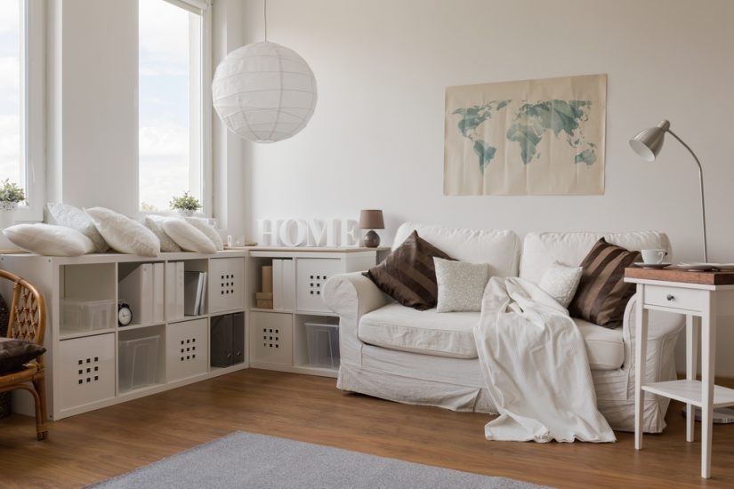
Cohesively an odd number of patterns look best — and three is the magic number. When putting together your pattern palette, start by selecting your “front and center” pattern, which will set the tone of the room and help you select your two “backdrop” patterns. Your front and center pattern should make the biggest statement, so look for a large-scale and eye-catching print. Your backdrop patterns should serve as support, not compete for attention. With too many spotlight-seeking patterns, you’ll land amidst the exact design frenzy you’re trying to avoid.
Let color be your guide.
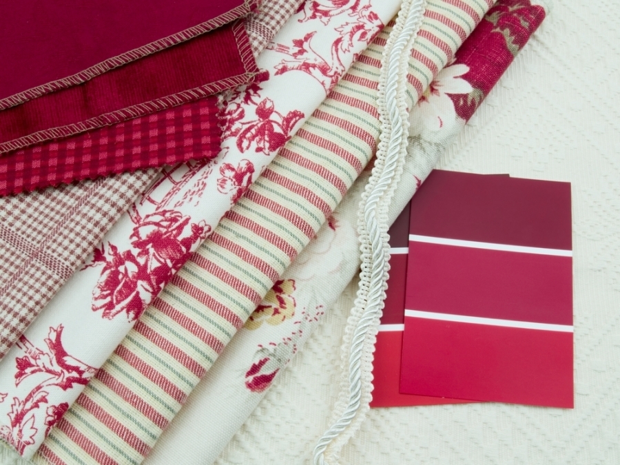
When mixing and matching, knowing which patterns are complementary is not always so obvious. When in doubt find patterns that contain one or more of the same color. There’s no rule that says you can’t pair floral and plaid, or chevron and stripes — unless they are in contrary colors. Work within your color scheme and let the similar shades be what unites the different elements throughout the room.
Keep things simple and seasonal.
Patterns are a great way to transition your home from one season to the next. Pick key points within the room, such as kitchen linens and curtains, to rotate out for different holidays or times of the year. As we approach the end of December, Tartan or buffalo plaid, and other festive winter patterns, can give your kitchen a touch of merriment without taking away from the other decorations in your home. Red and green or blue and white may be the colors of the moment, but there are plenty of other ways to represent these magical months in your home décor. Be adventurous with metallic embellishments that symbolize the sparkle of snow, or a deep maroon as rich as ripe berries.
Regard texture and style when picking your patterns.
The way a pattern feels and its style (casual, formal, and so on) may not seem relevant when choosing patterns, but it is. For instance, light linen would clash next to heavy fleece or rich brocade in the same way a vintage cotton floral would collide with a modern geometric print or sleek satin. Consider the style and feel of the fabric, as well as the time of year, when mixing and matching patterns. Is it summer or winter? Traditional or contemporary? Casual or formal? Keep these questions in the back of your mind to avoid a mismatching mishap.
Distribute decorations evenly.
One sure way to make a room feel overly busy is to concentrate patterns in one area. When arranging your decorations, be sure to maintain an even distribution so one side or section doesn’t feel heavier than another. If you add something to the right, don’t neglect the left. Balance your patterns throughout the space to achieve a purposeful look that doesn’t appear hectic or sloppy.
At TheRTAStore we help make your dream kitchen a reality with RTA (Ready To Assemble) cabinets, Pre-Assembled cabinets, and accessories with the same (if not better) quality you would find at any retail store but for a fraction of the price. Stop by our website or give us a call and let one of our friendly kitchen designers help make your kitchen dreams come true!